You’re scrolling through a website on your phone, eager to explore, but the images are oversized, the buttons are impossible to click, and you have to zoom in just to read the text. Frustrating, right? Now, think about how often potential customers encounter this very issue and abandon ship, and with them, businesses lose leads, sales, and trust.
In today’s world, where smartphones, tablets, and desktops are used interchangeably, responsive design is a necessity. With users expecting seamless experiences across all their devices, businesses can’t afford to let poor design stand in the way of success, poor designs are silent revenue killer.
This blog will walk you through the best practices for developers to create effective responsive web designs, ensuring smooth functionality, user satisfaction, and ultimately, business growth across any device.

What is Responsive Web Design?
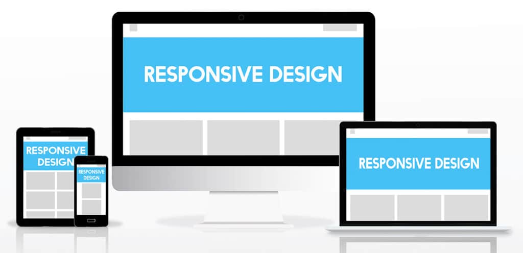
At its core, responsive web design is the approach that ensures a website adjusts seamlessly to fit various screen sizes and devices, whether it’s a desktop, tablet, or smartphone. Rather than creating different designs for each device, responsive design allows one layout to adapt fluidly, providing users with a consistent experience no matter how they access the site.
But why does responsiveness matter? First and foremost, it’s about user experience. Let’s look at the numbers. As of 2023, mobile devices account for over 58% of global website traffic, and that percentage is expected to grow. If a website isn’t optimized for mobile, it’s likely alienating more than half of its potential visitors. Additionally, according to a study by Google, 53% of mobile users will abandon a site if it takes longer than 3 seconds to load, highlighting how a poorly optimized or non-responsive design directly impacts user retention.
Beyond user experience, responsiveness plays a crucial role in SEO. Google’s algorithms prioritize mobile-friendly websites. So, a non-responsive design can hurt your SEO, pushing you down the search results and losing visibility to potential customers.
Struggling with a non-responsive site? Offtech specializes in web design solutions that boost user experience and keep visitors engaged. Offering the best web design services globally, we’re ready to help you create a website that truly performs. Get in touch today!
Mobile-First Approach
The mobile-first approach flips traditional web design on its head by prioritizing the design for smaller screens (mobile devices) first, then progressively enhancing it for larger screens like tablets and desktops. This concept stems from the idea that since more than half of internet users access websites through mobile devices, designing for mobile ensures a streamlined, user-friendly experience for the majority.
Why start with mobile? When you begin with mobile, you’re working within constraints like limited screen space and slower connection speeds. These challenges force developers to prioritize essential content, simplify navigation, and create a clean, efficient design that delivers a fast and intuitive experience. Scaling up to larger screens afterward allows for adding more complex features and richer content without compromising the core mobile experience.
Benefits of a mobile-first design
- Faster load times: Designing for mobile first ensures that all critical elements are optimized, leading to faster loading speeds, especially on slower mobile connections.
- Better user experience: Users on mobile devices get a streamlined and efficient experience, improving engagement and reducing bounce rates.
- Improved SEO performance: Since Google now uses mobile-first indexing, websites that prioritize mobile-friendly designs have a higher chance of ranking better in search engine results.
For developers focusing on mobile-first design, here are a few key points to keep in mind:
- Optimize performance: Reduce the use of heavy images, unnecessary scripts, and complex animations that could slow down mobile load times.
- Simplicity in navigation: Ensure the mobile version is easy to navigate with simple menus, large touch-friendly buttons, and minimal distractions.
- Prioritize content: Focus on what’s essential for the user on a small screen. Make sure that primary calls-to-action (CTAs), contact information, and key content are front and center.
- Test across devices: Even within the mobile category, screen sizes vary. Be sure to test your designs on multiple devices to ensure consistency and functionality.
Flexible Grid Layouts
In the world of responsive web design, fluid grids have replaced the old-school fixed-width layouts. Unlike fixed-width designs that remain the same regardless of screen size, fluid grids use relative units like percentages to create layouts that adapt seamlessly to different devices and resolutions.
The flexibility they offer ensures that your website looks great on everything from smartphones to widescreen monitors. Instead of creating a layout that works for just one screen size, fluid grids allow elements to scale dynamically based on the user’s device. This adaptability leads to a more consistent user experience and eliminates the need for multiple designs for various screen sizes.
For developers, utilizing CSS frameworks such as Bootstrap or Flexbox makes implementing fluid grid layouts far easier. These frameworks offer pre-built grid systems that are responsive out of the box:
- Bootstrap: With its 12-column grid system, Bootstrap allows you to build flexible layouts that automatically adjust based on the screen size, ensuring your content remains proportionally organized.
- Flexbox: Flexbox provides more control over alignment, spacing, and the distribution of elements within a container. Its ability to handle complex layouts with ease makes it an excellent tool for developers building responsive designs.
To ensure your grids adapt across various screen sizes, follow these best practices:
- Use relative units: Avoid fixed pixel values; instead, opt for percentages, ems, or rems to make your layout scale proportionally.
- Media queries: Incorporate media queries in your CSS to fine-tune how the grid behaves on different screen sizes. For example, you might want a single-column layout on small screens and a multi-column layout on larger screens.
- Test frequently: As you build your flexible grid, continuously test it across different devices and screen sizes to make sure it adapts as intended.
Responsive Typography

Typography is a crucial part of responsive web design, but it’s often overlooked. Having scalable fonts and proper line heights ensures readability across devices, making the text adaptable for small mobile screens or large desktop displays without sacrificing user experience.
One of the main principles of responsive typography is to use relative units like em or rem instead of fixed units like px. Why? Fixed units keep your font sizes static, which might work on a desktop, but can cause issues on smaller devices, where the text might appear too large or too small. Relative units, however, scale based on the device or the user’s browser settings, allowing for a more flexible and accessible design.
For example:
- em: Scales based on the font size of the element’s parent. It’s great for scaling fonts proportionally within a container.
- rem: Scales relative to the root element (html), providing consistency across the entire webpage, regardless of nesting.
Best practices for responsive typography:
- Adjust line heights: Ensure the line height scales proportionally with the font size to maintain readability, especially on smaller screens.
- Media queries for typography: Just like layouts, use media queries to adjust font sizes for different screen sizes. Larger text may be needed on smaller devices to maintain readability.
- Test for legibility: Always test your typography across multiple devices and screen resolutions to ensure it looks good and is easy to read.
Optimizing Images and Media
Images and media are often the largest components on a webpage, making it essential to optimize them for responsiveness and performance. Poorly optimized images can slow down page load times, especially on mobile devices, leading to a frustrating user experience. To avoid this, developers must ensure that images and media adapt seamlessly to different screen sizes and load efficiently.
One of the simplest techniques is to use CSS to make images flexible. By applying the max-width: 100% rule, you ensure that images scale down to fit within their container while maintaining their original aspect ratio. This allows the image to resize automatically for smaller screens without overflowing or becoming distorted.
Responsive images are another key aspect of media optimization. Using the srcset and sizes attributes in your HTML, you can serve different image sizes based on the user’s device or screen resolution. This means users on smaller devices get smaller, lighter images, while those on larger screens receive higher-resolution images for optimal quality.
Media Queries for Breakpoints
Media queries are like instructions that tell your website to adjust its layout depending on the screen size. They help your site look good whether it’s viewed on a phone, tablet, or desktop. For example, if the screen is small, your site might show a single column; on a bigger screen, it could display multiple columns.
When should you use media queries? Whenever your design starts to look squished or stretched on certain screen sizes, it’s a sign you need to adjust things. Media queries allow you to make those adjustments easily.
Best practices for media queries:
- Use a few common breakpoints, like for small screens (phones), medium screens (tablets), and large screens (desktops). This keeps things simple.
- Focus on where your content needs adjustments. Don’t worry about every possible screen size — just the main ones.
- Keep it simple. Too many breakpoints can complicate things and make it harder to maintain your design.
With a few well-placed media queries, your site will adapt beautifully to different devices without making things too complicated.
Performance Optimization

Responsive design isn’t just about how your site looks on different devices — it’s also about performance. A responsive website should load quickly, especially on mobile devices, where slower connections are common. Poor performance can lead to users leaving your site before it even loads.
How to improve performance:
- Minify CSS and JavaScript: Minifying means removing unnecessary spaces, comments, and characters from your code, making the files smaller and faster to load. Tools like Minify or UglifyJS can help with this process, speeding up your website.
- Reduce HTTP requests: Every time a browser loads a webpage, it makes requests for different files (like images, CSS, and scripts). The more requests, the slower the site. Combining files and limiting the number of images or scripts can cut down on those requests and make your site load faster.
Optimizing performance, especially for mobile users, ensures that your responsive website isn’t just functional, it’s fast and efficient, improving the overall user experience.
Want to ensure your website is optimized for mobile and desktop alike? Offtech’s expert team is ready to help you create a seamless, responsive design. Get in touch now!
In Summary
Creating a responsive web design that works seamlessly across all devices is no longer optional, it’s a must. From optimizing layouts with flexible grids to ensuring fast load times with performance tweaks, the steps outlined in this blog will help developers create websites that not only look great but also perform flawlessly.
Ready to take your website to the next level? Get in touch with Offtech, one of the best web design companies in Montreal. Our team of experts is here to help you build a responsive, high-performing site that keeps your audience engaged on every device.
